Kudos
Week 1 + 2
Goals
- Learn about Kudos!
- Gain an understanding of some essential developer tools
- Install git, Node, and VSCode
- Create and clone your own repository
How will this work?
Weekly session where we will:
- Go over the session's goals
- Code together
- Get support if needed
- Recap
By the end, we will have a finshed project!
Why Kudos?
At Blueprint, recognizing the contributions of our developer members is crucial for fostering a positive and productive project team environment. This tool is specifically designed to highlight the efforts of these members and gather valuable feedback. By acknowledging their hard work, especially amidst their academic and other commitments, we aim to improve their overall project team experience and prevent potential feelings of being overworked or burnt out.
Setup
For any project, it is essential to have certain 'tools' installed...
These tools go by many names:
- libraries
- environments
- packages
- dependencies
- etc.
But they all serve one broad purpose: help developers build.
So, before we begin building our project, lets first install all of the necessary tools we'll need along the way.
Git and GitHub
A key foundation of software development is collaboration.
Across industry, developers collaborate using two essential tools: Git and GitHub
Later on, we will explore these two tools, but for now lets just install them.
Windows install
- Go to the official Git website at https://git-scm.com/downloads
- The download for Windows should begin automatically.
- Once the installer finishes downloading, run the
.exefile. - Follow the prompts in the installation wizard.
- After installation, open a new terminal and type
git --versionto verify the installation.
macOS install
- The easiest way to get Git on macOS is in the terminal.
- Open your Terminal application.
- Type
git --versionand press enter. - If Git is not installed, a pop-up will appear asking you to install the command line developer tools. Click "Install" and follow the on-screen instructions.
Now, lets create and authenticate a GitHub account.
Creating Your GitHub Account
Creating a GitHub account is a simple process.
- Go to the GitHub Website: Open your web browser and navigate to github.com.
- Sign Up: On the homepage, you'll see a sign-up form. Enter your email address, create a password, and choose a username.
- Verification: You'll likely need to solve a quick puzzle to verify you're human. After that, GitHub will send a verification code to the email address you provided. Go to your inbox, find the email, and enter the code on the GitHub site.
That's it! You now have a GitHub account.
Authenticating Your Account
Authentication proves your identity when you want to push (upload) or pull (download) code from your computer. Using your password for this is no longer supported for security reasons. Instead, you should use a Personal Access Token (PAT).
A PAT is like a long, secure password that you use only for accessing GitHub from the command line or apps.
-
Go to Your Settings:
- Click on your profile picture in the top-right corner and select Settings.
- In the left sidebar, scroll down and click on Developer settings.
- Click on Personal access tokens, then select Tokens (classic).
-
Generate a New Token:
- Click the Generate new token button.
- Set an Expiration date. For better security, don't set it to "No expiration". 90 days is fine.
- Under Select scopes, select the
reposcope.
-
Copy and Save Your Token:
- Click the Generate token button at the bottom.
- This is the only time you will see the token!!! Copy it immediately and save it in a secure place, like a password manager. If you lose it, you'll have to generate a new one.
-
Using Your PAT:
- Now, when you perform a Git operation in your terminal (like
git push) that requires authentication over HTTPS, you'll be prompted for your username and password. - Enter your GitHub username.
- When asked for your password, paste your Personal Access Token.
- Now, when you perform a Git operation in your terminal (like
You're all set! Your GitHub account is now created and authenticated for use on your computer.
Node
Like git, Node is a tool in the software development world that is a must-have.
Among many other things, it allows us to see the changes in our code live in our browser!
So as we add components of our app, we can ensure they look and function as we want them to.
Windows
- Go to the official Node.js website: https://nodejs.org/en/download
- Download correct verion.
- Run the installer and follow the on-screen instructions.
- Once the installation is complete, you can open the terminal and verify the installation by typing:
node -v
npm -v
These commands should return the version numbers for Node.js and npm, confirming a successful installation.
macOS
- The easiest way is to download the official
.pkginstaller from the Node.js website: https://nodejs.org/en/download - Choose the LTS version and run the installer after it downloads.
- Follow the installation steps. The installer will guide you through the process.
- After installation, open a new Terminal window and run the same commands as above to verify:
node -vandnpm -v.
Visual Studio Code
We will be writing all of our code using Visual Studio.
Visual Studio has a simple install. Simply use this link and follow the steps: https://code.visualstudio.com/download
Troubleshooting
Before we move on, lets address some common issues that you may run into during setup.
Checking Node Versions (Windows Users)
If you recieve an error when running the node - v and npm -v commands:
- Search 'Terminal' in your taskbar start menu.
- Hover over the Terminal Icon, then right-click.
- A menu should appear. Click on the option to 'Run as Administrator'. This should open a new terminal that indicates you are an Administrator in the title bar.
- Run this command:
Set-ExecutionPolicy RemoteSigned. - Now, try running
node - vandnpm -vonce again, and you should be able to see their versions, confirming your Node has installed correctly.
Creating a Repository
You now know the basics of git and GitHub!
The next step is to create your own repository where you'll store all of your code for the project.
On the main page of GitHub's site, you will see a green box in the top left corner that says 'New'.
Click it, and you will be redirected to a new page that looks like this:
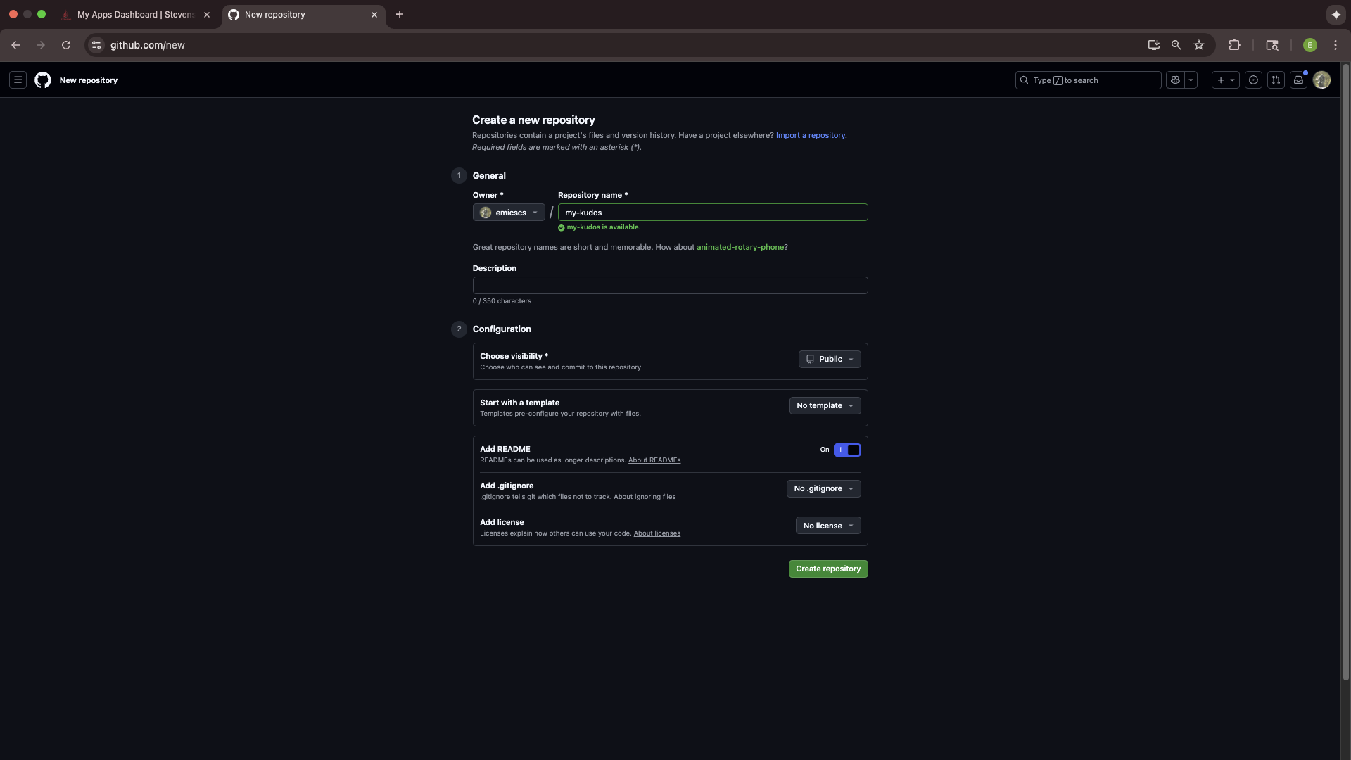
On this page, you will enter the details of your repository. In our case, this includes a specific set of options that oyu should copy from the screenshot above. Your repository name should be my-kudos, visibility should be public, and add README option shoud be toggled on.
Click create, and you will again be redirected.
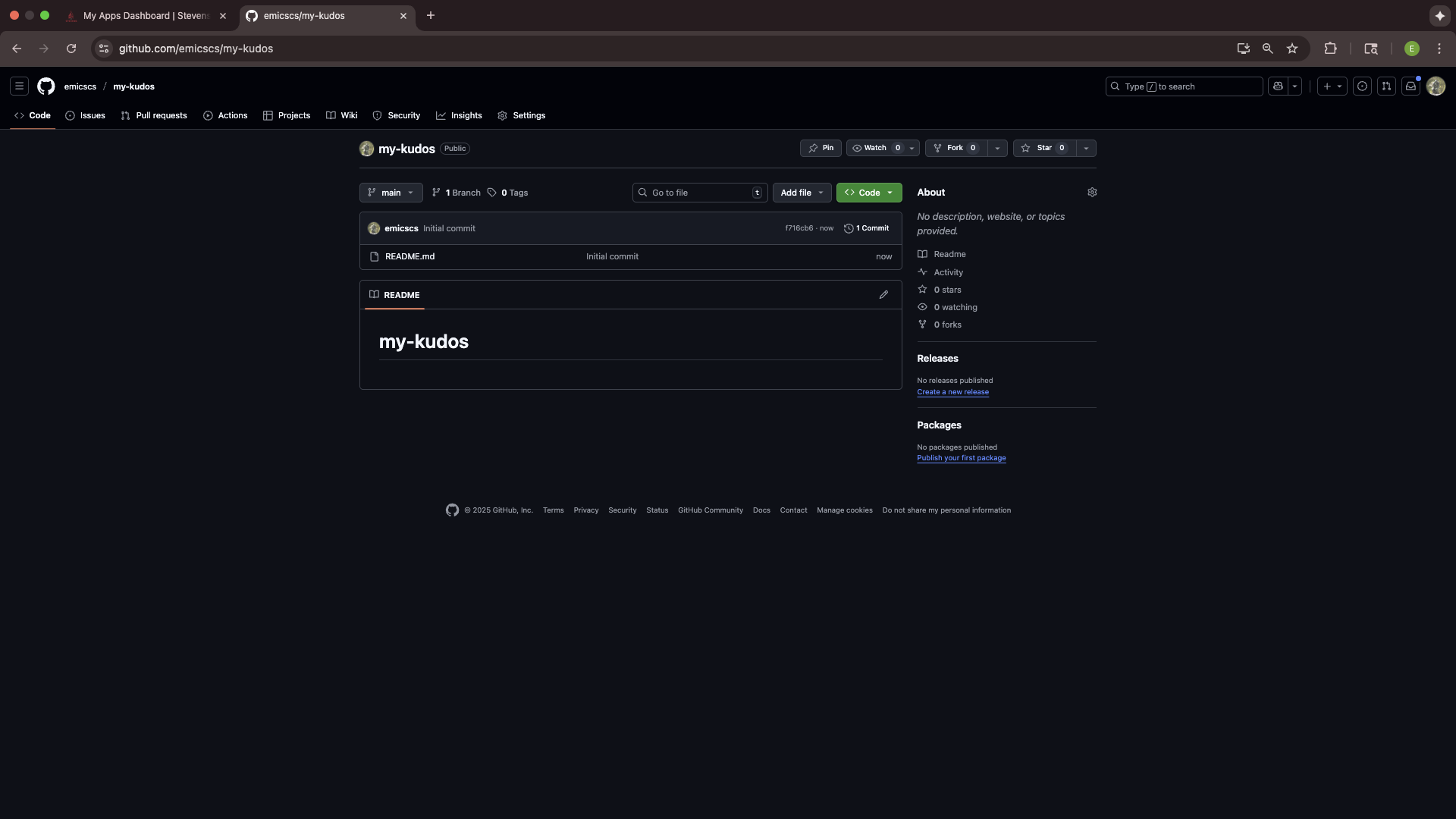
This is your repo! Now, all you have to do is follow some of the steps from the prior section.
The first is cloning your repo with git clone.
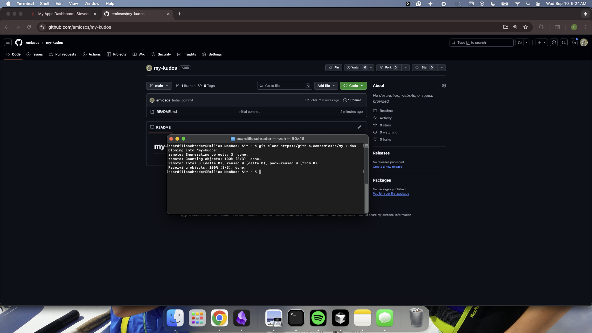
Like before, to check that the clone was successful, cd into your new directory.
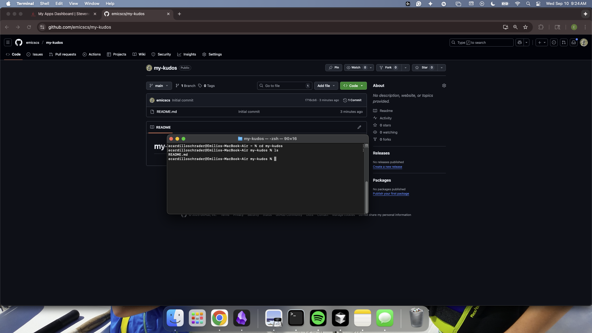
Note: In this example, I also used the ls command, which lists the contents for your directory. Since we just created our repo and initialized it with a README.md file, the only thing in our project folder should be that file - and it is.
Making a Change
As a way to test what we've done so far, lets try actually making changes to file and seeing them reflected in our repository.
Our goal will be to edit a file in our project - then upload the changes to our GitHub repo using the commands we just learned.
Editing a file
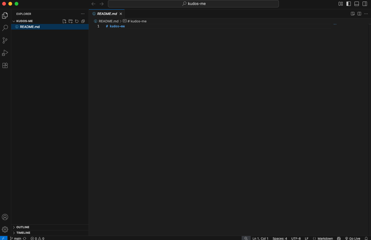
In VSCode, open your README.md file.
It should look something like this:
Lets make a simple change: add a short sentence about yourself!
It should look like something like this:
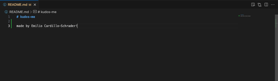
Note: Those green bars next to each of the lines we just wrote indicate that these are new (uncommitted) lines. This is good! It means that we now have code to upload (commit) to our repo!
Making a Commit
Once the change is made, use the git add command in order to include or 'stage' our changes for the next commit. Commits can be thought of as checkpoints; more on that later.
In this case, we made changes to the README.MD , so our file path is /README.MD and we type in:
git add /README.MD
Note: You can use git add to add as many files as you need, and another common option is to use git add . to add all files with changes. Also, The file path is case sensitive.
Checking Changes to be Committed
You can use the git status command to check what files have been added or "staged" for a commit to ensure you added the right things. In this case, it's only the one contributors file that we added.
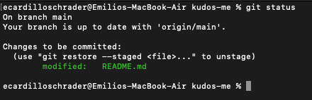
You can see here that our file is under changes to be committed and is in green text. Changes not staged for commit will be in red (if there are any).
Committing Changes
With our changes made and staged, we can create a commit which can be thought of as a checkpoint for our code. We can revert to this point if we make mistakes or need to look at the version of the code at this point in time.
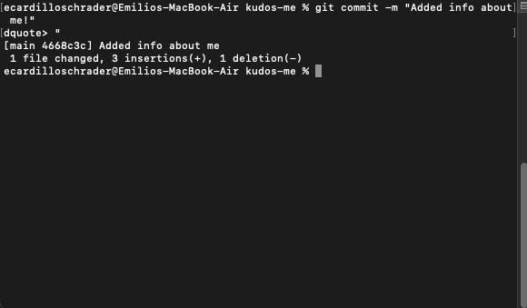
It is also good practice to include a commit message by using the -m flag to describe what changes were made. For us, we will just say that we are adding a new contributor, like so:
git commit -m "Added info about me!"
Commit Messages: When writing a commit, it is usually good practice to follow a convention. At Blueprint, we use the Conventional Commits specification: www.conventionalcommits.org, but don't worry about that right now!
We can commit as often as we want, or when we feel it is necessary before making big changes.
Pushing a Commit
In order for our changes to appear on the remote repository (the one on Github, which is online), we need to push our changes using the git push command. If we run it as is, however, we will encounter an error:
It is no big deal - the reason it happens is because when we create the branch contributors/johnDoe, we only created it locally and it does not exist on the Github repository.
Therefore, we must run the command shown:
git push --set-upstream origin contributors/<your name>
Once the branch is set up remotely, or if the branch already existed remotely and was not created locally, we can simply use git push.
Seeing our Changes
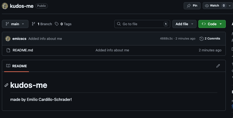
Finally, we can confirm that all of these steps were done correctly by going over to our repo on GitHub and refreshing the page.
Upon doing so, we should see any changes we made reflected on the web, like this:
Note: Another way to check is by opening VSCode again, and seeing if those green bars from earlier are still there. If not, then that means there are no new lines to stage, and your commit was successful!
Project Outcomes
At the end of our time together, I hope that you all improve on a two key areas of software development:
Technical Skills
- Development Patterns: Hooks, Context, functional components
- State Management: Complex state updates and data relationships
- User Experience Design: Responsive, accessible, intuitive interfaces
- Problem Solving: Handling edge cases and data integrity
Project Management Skills
- Incremental Development: Built feature by feature
- Requirements Analysis: Translated real needs into technical specifications
- Testing Strategy: Systematic verification of functionality
- Documentation: Clear code organization and commenting
Week 3
Goals
- Intro to CSS
- Building a demo page
- Implementing the
KudosCardcomponent
A Note About Project Versions and Installations...
I knwo we had some mix-ups and discrepencies last session when trying to create a project.
So, we need to do some cleaning to ensure there is no confusion in the future with project names, versions, etc.
Let's take a few minutes to delete all prior projects relating to Kudos (blueprint_kudos, kudos-me, etc.)
For the last time (fingers crossed) let's create a React project configured to use TypeScript.
In your root directory, run:
npx create-react-app blueprint_kudos --template typescript
After running, you may be asked a few questions. Simply respond yes to all of them.
Then, to open your project in VSCode and start your live development server, run:
cd blueprint_kudos
npm install
npm start
Part 1: CSS Basics
Last week you saw some live changes made to the browser, and hopefully gained some understanding of why we really need tools like Node and git.
This week, we will be getting hands-on with one of the main languages of our app: CSS.
What is CSS?
CSS, which stands for Cascading Style Sheets, is a style sheet language used for describing the presentation of a document written in a markup language like HTML.
Basically, it makes websites look nice.
HTML
You may have heard of HTML, but what does it actually do?
HTML is the structure of a webpage. It's like the skeleton or framework that holds everything together.
Here is some brief info about HTML before we begin diving into CSS. Feel free to check out some tutorials/videos on HTML ifn you want to learn more tha what is in these docs.
How HTML Works
<h1>This is a heading</h1>
<p>This is a paragraph</p>
<button>Click me</button>
Cheatsheet
Use this as a cheatsheet for whenever you forgot/don't know which tags to use.
-
<h1>,<h2>,<h3>- Headings (big to small) -
<p>- Paragraphs -
<div>- Container/box -
<button>- Clickable buttons -
<img>- Images -
<a>- Links
And remember: HTML is the foundation - everything else builds on top of it!
A Useful Analogy
A classic analogy that I will probably continue using throughout the next few sessions is this:
Our app is like a house...
HTML is the walls.
TypeScript is the door.
CSS is the paint.
We need all three to build a house, and in our case, this app.
But, specifically, CSS controls:
- Colors - text, backgrounds, borders
- Layout - where elements appear on the page
- Typography - fonts, sizes, spacing
- Visual effects - shadows, animations, hover effects
Let's see how this works in practice.
Classes
You may have heard of classes before... but CSS classes are slightly different.
CSS classes are reusable style definitions that you can apply to HTML elements. They're like templates for styling that you can use over and over again.
We can think of CSS classes like labels or tags that you apply to HTML elements to style them.
Imagine you have a box of different colored stickers:
- Yellow stickers for "important" items
- Red stickers for "urgent" items
- Green stickers for "completed" items
You stick these labels on different objects, and everyone knows what each color means.
CSS classes work the same way. You "stick" a class name on an HTML (wall) element, and the browser knows how to style it with CSS (paint).
Selectors
Before we can style anything, we need to tell CSS what we want to style. This is where selectors come in.
The purpose of selectors is to tell CSS which HTML elements we want to style
Let's create a simple demo TypeScript file to see this in action.
First though, let's create a directory (folder) to store our components:
CREATE: src/components
Then,
CREATE: src/components/CSSBasicsDemo.tsx
// Creating the demo component
export function CSSBasicsDemo() {
  return (
    <div className="demo-container"> {/* 1. demo-container class*/}
      <h2>CSS Basics Demo</h2>
      <div className="box-model-demo">
        <h3>Box Model</h3>
        <div className="box-example"> {/* 2. box-example class */}
          <div className="content">Content</div>
        </div>
      </div>
    </div>
  );
}
export default CSSBasicsDemo;
Now, let me add the CSS file. Notice how I'm targeting these elements using class names:
CREATE: src/components/CSSBasicsDemo.css
/* I'm targeting the demo-container class */
.demo-container {
  max-width: 800px;
  margin: 0 auto;
  padding: 20px;
}

/* I'm targeting the box-example class */
.box-example {
  width: 200px;
  height: 100px;
  padding: 20px;
  margin: 20px;
  border: 3px solid #3b82f6;
  background-color: #f8fafc;
}
See how this works? I'm using class names - those are the words after 'className=' in the HTML - to target specific elements. This is the most common way to style things in React.
Recall: src/App.tsx is the main file in any React project, because it is where the main application structure is defined, and where each component is referenced.
So, let's update ours with our new components:
import React from 'react';
import { CSSBasicsDemo } from './components/CSSBasicsDemo'; // refernces .tsx demo file
import './components/CSSBasicsDemo.css'; // refernces .css demo file

function App() {
	return <CSSBasicsDemo />;
}

export default App;
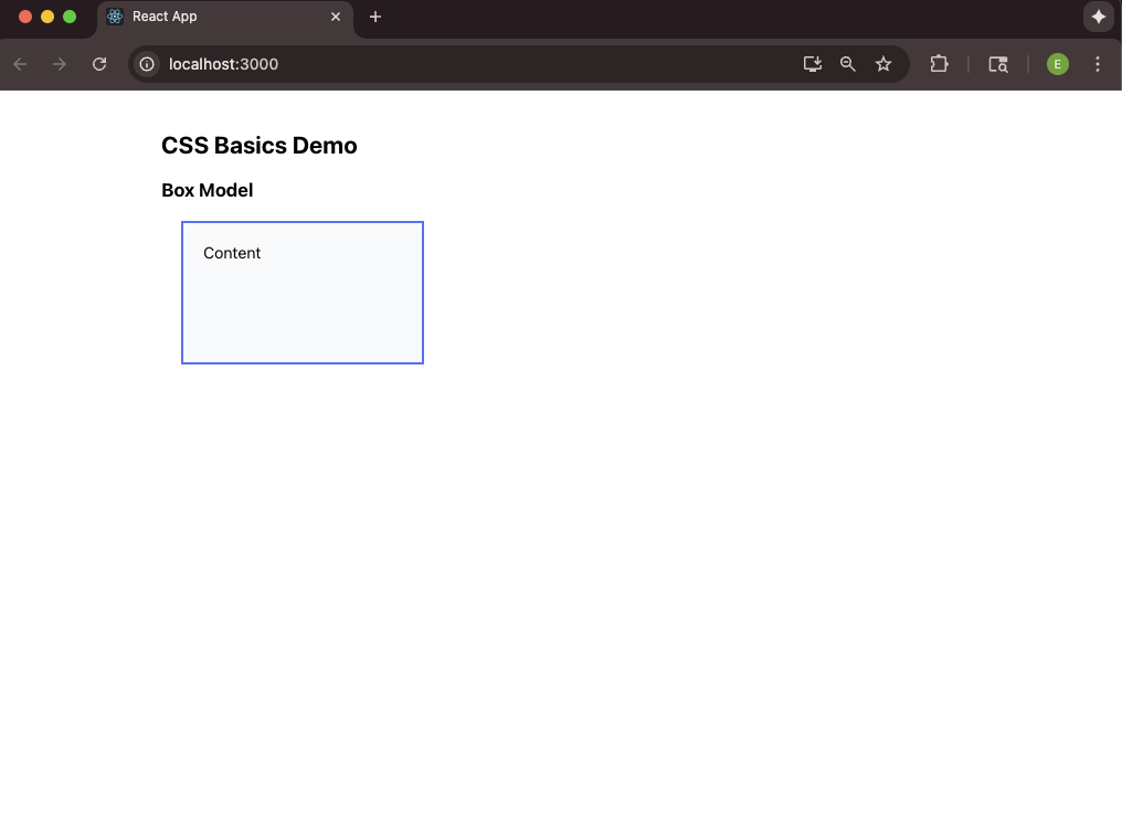
If you're seeing a page that looks like this, then you've done everything correctly so far!
The Box Model
Note: This is a VERY important section, so be sure to ask any questions if you need to. The Box Model is absolutely crucial to understand.
The Box Model describes that every single element on a webpage is a box.
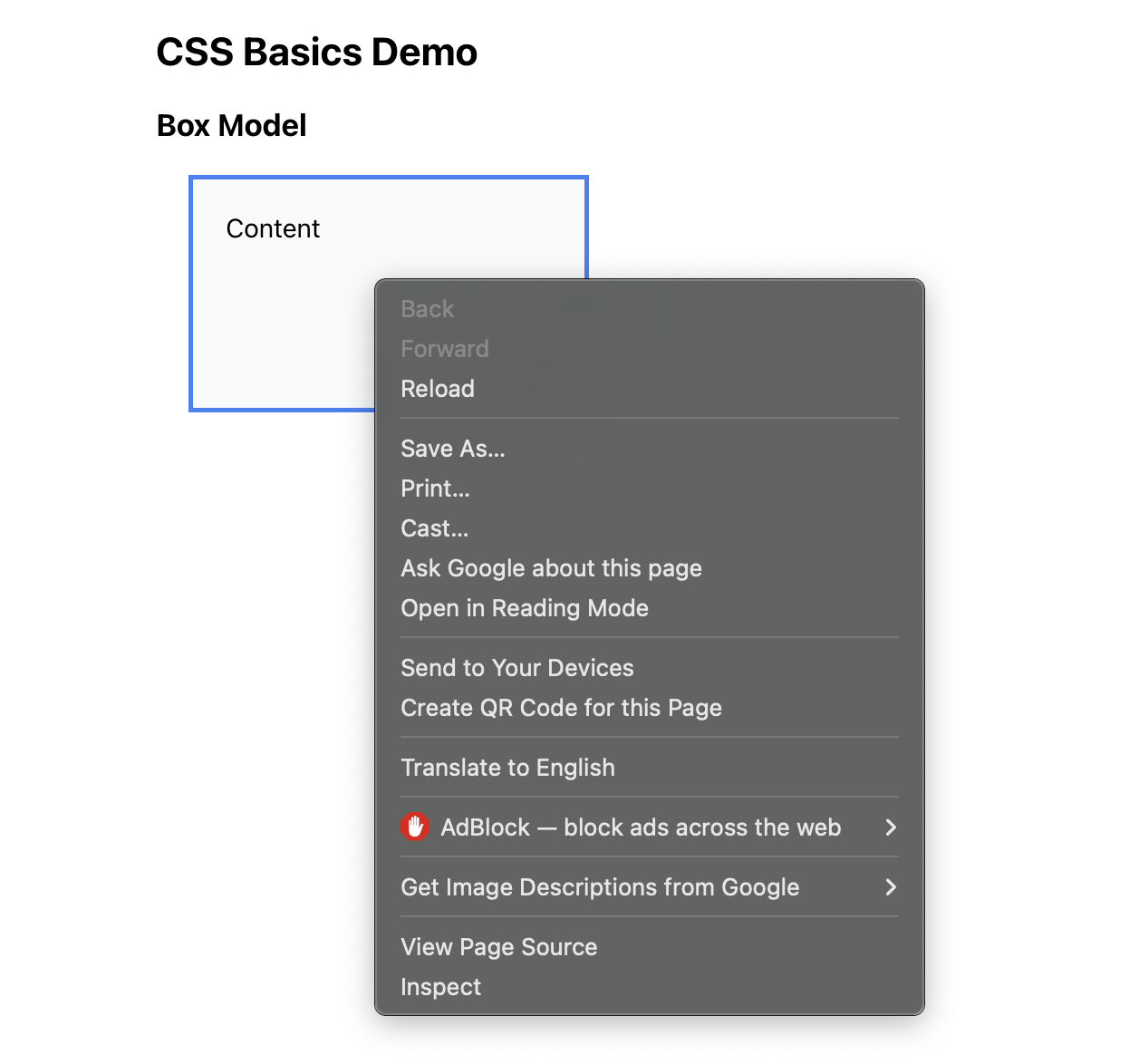
To show you what I mean, let's use some developer tools (DevTools) made availible to us through Inspect Element.
To access your DevTools, right-click the object you want to examine (in our case, the blue box), and selectInspect Element from the dropdown.
You should now see a new window appear. It should look something like this:
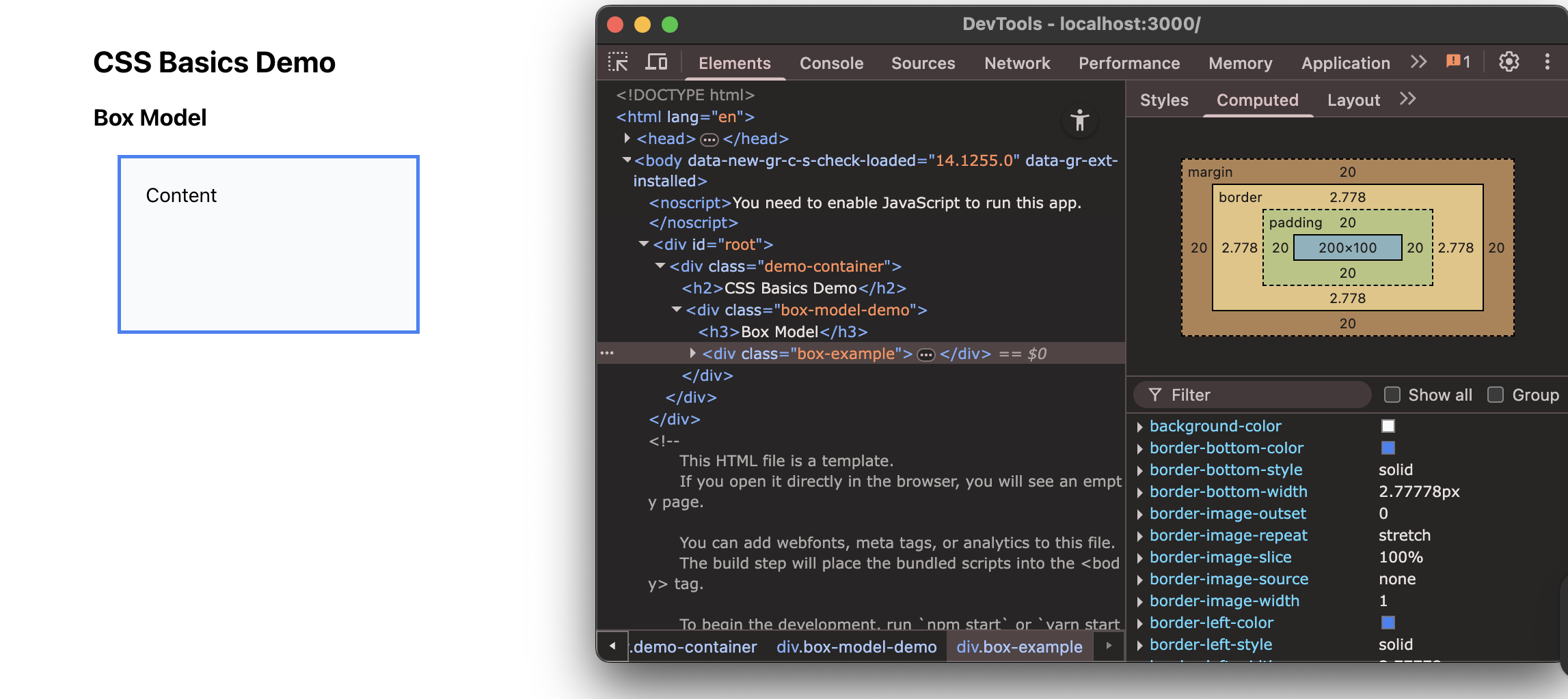
Let me break down what's happening here:
Each class is made up of properties which describe it in many ways.
In this example:
- The content is the actual text or image inside.
- Padding is the space inside the element, between the content and the border. That's the white space around the blue text.
- The border is the line around the element. That's the blue line you see.
- Margin is the space outside the element, between this element and other elements.
Let's see what heppns when we make a change to one of these properties...
First, hover over some of the <div>s so you can see exactly how your code is visualized on our webpage. Like this:
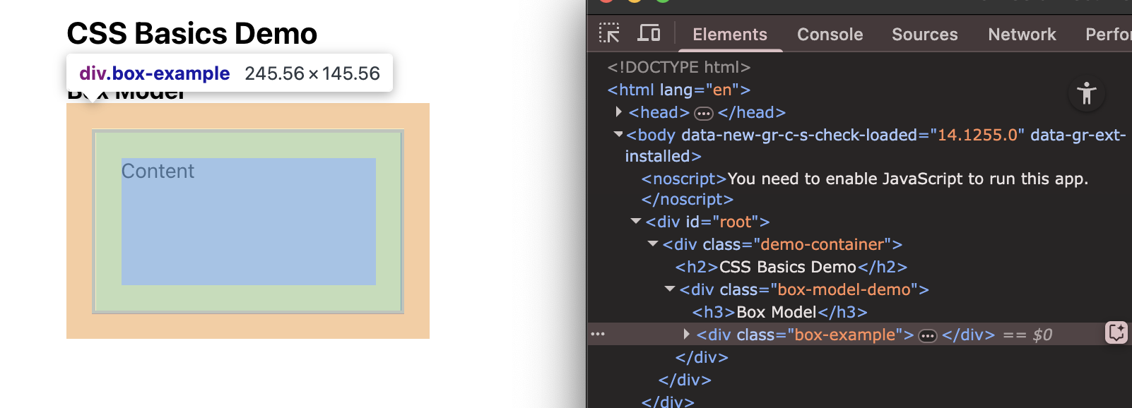
See how when my mouse is hovered over "box-example" it is highlighted on our webpage? This makes knwoing what our code does visually super clear.
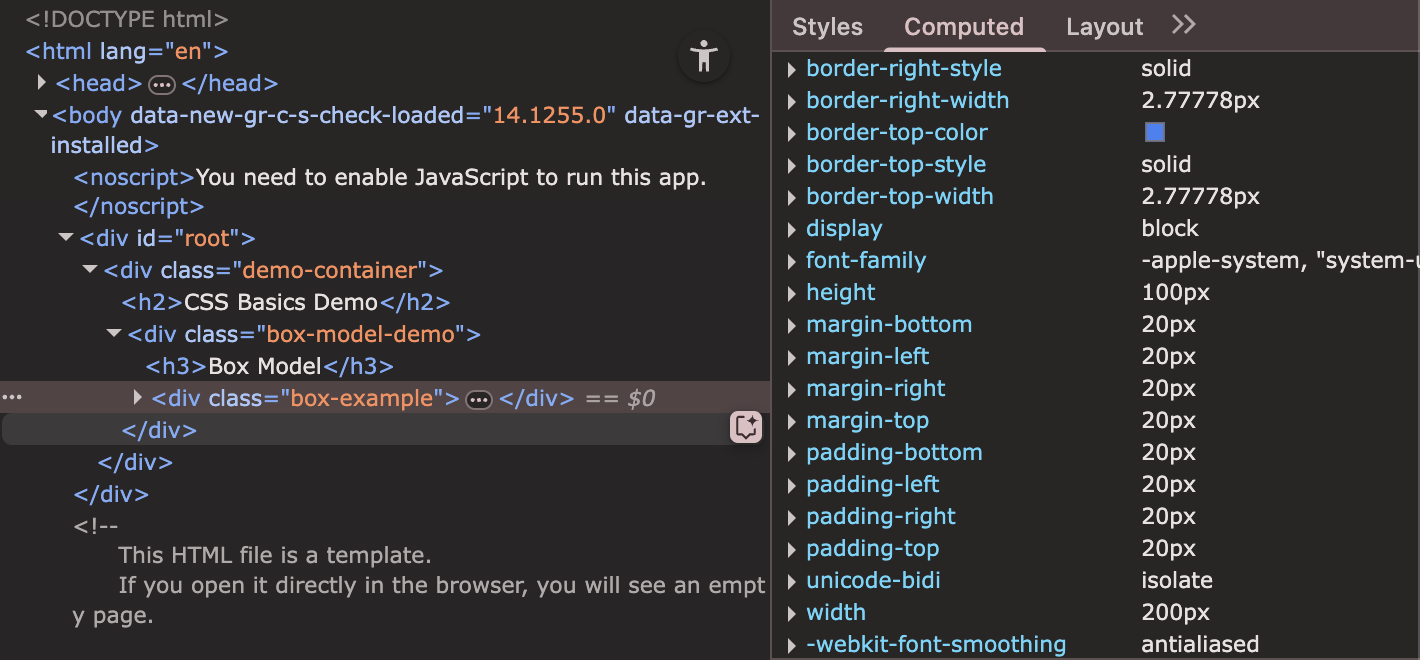
We can see the properties of any element we want in the right panel that looks like this:
Hmm... some of those properties in the panel seem very familiar...
Remember how we gave our classes certain properties earlier in src/components/CSSBasicsDemo.css? We can now play around with their values to see their effect visually on our webpage.
Let's do some experimentation.
UPDATE: src/components/CSSBasicsDemo.css
.box-example {
  padding: 40px; /* Changed from 20px */
}
See how the content moved further from the border? That's padding.
Now let us change the margin...
.box-example {
  margin: 40px; /* Changed from 20px */
}
See how the entire box moved away from other elements? That's margin.
This is so important because when you're building layouts, you need to understand how these four things work together.
Most layout problems you'll face when first starting off come from not understanding the box model.
To close off this section, experimentsome more with the box-example properties and see the changes visually in your live server.
.demo-container {
  max-width: 800px;
  margin: 0 auto;
  padding: 20px;
}

/* Play around here and see the visual changes */
.box-example {
  width: 200px;
  height: 200px; /* 100 -> 200 */
  padding: 80px; /* 20 -> 40 -> 80 */
  margin: 60px; /* 20 -> 60 */
  border: 3px solid #3b82f6;
  background-color: #f8fafc;
}
Part 2: Building Our Kudos Card Component
Step 1: Planning Our Component
In software development, the first step is always to plan.
Since we already have an idea of what our end product looks like, and we now understand how our app is structured, we can actually do this step without any pre-existing visualization!
But, because we have an end product already, let's look back to it and create a quick list of components we will need to build.
[look at final Kudos example from Week 1]
One clear one that we should consider is the card layout - especially since it is the heart of our app.
Let's think about what this component needs:
- A recipient's name
- The kudos message
- Who gave the kudos
- When it was given
- What type it is (kudos or feedback)
This is a great example of a real-world component. It's not too simple, but not too complex either.
Let me create the basic structure first...
Step 2: Structuring the Component
Let's create a new file for our kudos card component.
Note: In React, it's common to have one component per file.
CREATE: src/components/KudosCard.tsx
import React from 'react';

interface KudosCardProps {
  recipient: string;
  message: string;
  giver: string;
  type: 'kudos' | 'feedback';
  date: string;
}

export function KudosCard({ recipient, message, giver, type, date }: KudosCardProps) {
  return (
    <div className="kudos-card">
      <div className="kudos-header">
        <h3 className="recipient-name">{recipient}</h3>
        <span className="kudos-type">{type}</span>
      </div>

      <p className="kudos-message">{message}</p>

      <div className="kudos-footer">
        <span className="giver-name">From: {giver}</span>
        <span className="kudos-date">{date}</span>
      </div>
    </div>
  );
}
Let me walk through what I'm doing here:
First, I'm defining the TypeScript interface. This tells us exactly what props this component expects. This is really helpful because if someone tries to use this component incorrectly, TypeScript will catch the error.
The component structure is semantic - I'm using meaningful HTML elements. The header contains the recipient name and type, the message is in a paragraph, and the footer has the giver and date.
Notice how I'm using className for all the styling. This is how we connect our HTML to our CSS.
Now let me add the CSS...
Step 3: Applying CSS Styles
I'm creating a separate CSS file for this component. This keeps things organized and makes the component reusable.
CREATE: src/components/KudosCard.css
/* src/components/KudosCard.css */

.kudos-card {

	/* Box Model */
	width: 100%; /* Full width of container */
	max-width: 400px; /* Maximum width */
	padding: 24px; /* Space inside the card */
	margin: 16px 0; /* Space above and below */
	border: 1px solid #e2e8f0; /* Light gray border */
	border-radius: 12px; /* Rounded corners */

	/* Layout */
	display: flex; /* Make it a flex container */
	flex-direction: column; /* Stack children vertically */
	gap: 16px; /* Space between children */

	/* Colors */
	background-color: #ffffff; /* White background */
	color: #1e293b; /* Dark gray text */

	/* Typography */
	font-family: 'Inter', -apple-system, sans-serif; /* Font family */
	font-size: 14px; /* Base font size */
	line-height: 1.5; /* Line spacing */

	/* Visual Effects */
	box-shadow: 0 2px 4px rgba(0, 0, 0, 0.05); /* Subtle shadow */
	transition: all 0.2s ease; /* Smooth transitions */
}
Let me break this down:
I'm using the box model we learned about: padding for internal space, margin for external space, border for the outline.
max-width: 400px means the card won't get wider than 400 pixels, but it can be smaller on mobile devices.
display: flex with flex-direction: column stacks the elements vertically.
gap: 16px puts consistent space between all the child elements.
I know we can really strecth our skills though, so let's keep adding props...
For the hover effect from before:
	/* ...prior code... */

.kudos-card:hover {
  transform: translateY(-2px);
  box-shadow: 0 8px 25px rgba(0, 0, 0, 0.1);
  border-color: #cbd5e1;
}
This creates a nice interactive effect. When you hover over the card, it should move up slightly and get a stronger shadow.
Now let me style the header...
	/* ...prior code... */

.kudos-header {
  display: flex;
  justify-content: space-between;
  align-items: center;
  margin-bottom: 8px;
}

.recipient-name {
  font-size: 18px;
  font-weight: 600;
  color: #0f172a;
  margin: 0;
}

.kudos-type {
  padding: 4px 12px;
  border-radius: 20px;
  font-size: 12px;
  font-weight: 500;
  text-transform: uppercase;
  letter-spacing: 0.5px;
}
The header uses flexbox to put the name on the left and the type badge on the right.
The type badge has rounded corners (border-radius: 20px) and is styled like a pill.
Let me add different colors for different types...
	/* ...prior code... */

.kudos-type.kudos {
  background-color: #dbeafe;
  color: #1e40af;
}

.kudos-type.feedback {
  background-color: #f3f4f6;
  color: #374151;
}
This uses CSS class combination. When an element has both kudos-type and kudos classes, it gets the blue styling. When it has kudos-type and feedback, it gets the gray styling.
Now let me style the message and footer...
	/* ...prior code... */

.kudos-message {
  font-size: 15px;
  line-height: 1.6;
  color: #475569;
  margin: 0;
  flex-grow: 1;
}

.kudos-footer {
  display: flex;
  justify-content: space-between;
  align-items: center;
  padding-top: 12px;
  border-top: 1px solid #f1f5f9;
  font-size: 12px;
  color: #64748b;
}
The message uses flex-grow: 1 which means it will take up all available space, pushing the footer to the bottom.
All together now...
/* src/components/KudosCard.css */

.kudos-card {

	/* Box Model */
	width: 100%; /* Full width of container */
	max-width: 400px; /* Maximum width */
	padding: 24px; /* Space inside the card */
	margin: 16px 0; /* Space above and below */
	border: 1px solid #e2e8f0; /* Light gray border */
	border-radius: 12px; /* Rounded corners */

	/* Layout */
	display: flex; /* Make it a flex container */
	flex-direction: column; /* Stack children vertically */
	gap: 16px; /* Space between children */

	/* Colors */
	background-color: #ffffff; /* White background */
	color: #1e293b; /* Dark gray text */

	/* Typography */
	font-family: 'Inter', -apple-system, sans-serif; /* Font family */
	font-size: 14px; /* Base font size */
	line-height: 1.5; /* Line spacing */

	/* Visual Effects */
	box-shadow: 0 2px 4px rgba(0, 0, 0, 0.05); /* Subtle shadow */
	transition: all 0.2s ease; /* Smooth transitions */

}

.kudos-card:hover {

	transform: translateY(-2px); /* Move up slightly on hover */
	box-shadow: 0 8px 25px rgba(0, 0, 0, 0.1); /* Stronger shadow on hover */
	border-color: #cbd5e1; /* Lighter border on hover */
}


.kudos-header {
	display: flex; /* Make it a flex container */
	justify-content: space-between; /* Space items apart */
	align-items: center; /* Center items vertically */
	margin-bottom: 8px; /* Space below header */
}

.recipient-name {
	font-size: 18px; /* Larger font size */
	font-weight: 600; /* Bold text */
	color: #0f172a; /* Very dark gray */
	margin: 0; /* Remove default margin */
}

.kudos-type {
	padding: 4px 12px; /* Space inside badge */
	border-radius: 20px; /* Pill-shaped */
	font-size: 12px; /* Small font size */
	font-weight: 500; /* Medium bold */
	text-transform: uppercase; /* All caps */
	letter-spacing: 0.5px; /* Space between letters */
}


.kudos-type.kudos {
	background-color: #dbeafe; /* Light blue background */
	color: #1e40af; /* Dark blue text */
}


.kudos-type.feedback {
	background-color: #f3f4f6; /* Light gray background */
	color: #374151; /* Dark gray text */
}


.kudos-message {
	font-size: 15px; /* Slightly larger font */
	line-height: 1.6; /* Good line spacing */
	color: #475569; /* Medium gray text */
	margin: 0; /* Remove default margin */
	flex-grow: 1; /* Take up available space */
}


.kudos-footer {
	display: flex; /* Make it a flex container */
	justify-content: space-between; /* Space items apart */
	align-items: center; /* Center items vertically */
	padding-top: 12px; /* Space above footer */
	border-top: 1px solid #f1f5f9; /* Light border on top */
	font-size: 12px; /* Small font size */
	color: #64748b; /* Light gray text */
}

.giver-name {
	font-weight: 500; /* Medium bold */
}


.kudos-date {
	color: #94a3b8; /* Very light gray */
}
Finally, let's create a demo page to show this in action...
Step 4: Creating the Demo Page
We need to update the App component to show our kudos cards...
// src/App.tsx
import React from 'react';
import { KudosCard } from './components/KudosCard';
import './components/KudosCard.css';

function App() {
  const sampleKudos = [
    {
      recipient: "Jane Smith",
      message: "Amazing work on the authentication refactor! Your clean code and thorough testing saved us so much time.",
      giver: "John Doe",
      type: "kudos" as const,
      date: "Mar 22, 2024"
    },
    {
      recipient: "Mike Johnson",
      message: "Thanks for staying late to help debug the payment integration. Your persistence really paid off!",
      giver: "Sarah Wilson",
      type: "kudos" as const,
      date: "Mar 21, 2024"
    },
    {
      recipient: "Alex Chen",
      message: "Great job presenting the technical architecture to stakeholders. You explained everything so clearly!",
      giver: "Emily Davis",
      type: "feedback" as const,
      date: "Mar 20, 2024"
    }
  ];

  return (
    <div className="app-container">
      <div className="app-content">
        <h1 className="app-title">
          - Kudos Cards Demo -
        </h1>

        <div className="cards-grid">
          {sampleKudos.map((kudos, index) => (
            <KudosCard
              key={index}
              recipient={kudos.recipient}
              message={kudos.message}
              giver={kudos.giver}
              type={kudos.type}
              date={kudos.date}
            />
          ))}
        </div>
      </div>
    </div>
  );
}

export default App;
Let me add some CSS for the app layout...
/* Add to App.css or create App.css */
.app-container {
  min-height: 100vh;
  background-color: #f8fafc;
  padding: 32px 0;
}

.app-content {
  max-width: 1200px;
  margin: 0 auto;
  padding: 0 16px;
}

.app-title {
  font-size: 48px;
  font-weight: 700;
  text-align: center;
  color: #0f172a;
  margin-bottom: 32px;
}

.cards-grid {
  display: grid;
  grid-template-columns: repeat(auto-fit, minmax(350px, 1fr));
  gap: 24px;
}

@media (max-width: 768px) {
  .cards-grid {
    grid-template-columns: 1fr;
  }
}
Look at that! We have working kudos cards!!!
Notice how they respond to hover, how the different types have different colors, how the layout is clean and structured!
Week 4
Welcome!
Goals
- Discuss TypeScript essentials and how we should structure a component
- Build the Kudos form with
KudosForm.tsx
Quick Recap
Last week we learned:
- CSS fundamentals
- How to build the KudosCard component
- How to display multiple cards using sample data
A Quick Note...
The nest few sessions (weeks) will be dedicated to implementing KudosForm and the respective cards that are created after a submission is made.
This will take some time, so I decided to split it up into a few parts (3, to be exact). Part 1 covers the TypeScript aspect (this doc), part 2 dives into CSS by having you complete a challenge (week 5), and part 3 is about implementing state, also through a challenge (week 6). Before moving ahead and reading this doc, make sure you've read week 3 as you'll need it for the challenges that lie ahead... 🤫
Good luck!
Building the Kudos Form Component
Step 1: Setting Up the KudosForm File
First, let's create a new file for our form component.
We will start with just the imports and the component shell:
CREATE: src/components/KudosForm.tsx
import { useState } from 'react';
import './KudosForm.css';

export function KudosForm() {
  return (
    <div>
      <h2>Form goes here</h2>
    </div>
  );
}
What's happening:
- We import
useStatefrom React - this is the hook we'll use for state - We import our CSS file (which we'll create next)
- We export a function component called
KudosForm - For now, it just returns a simple div with text
Step 2: Defining the Props Interface
In this step, we are going to learn about a few key React topics so be sure to ask questions if you are confused.
Currently, we know that our form needs some way to communicate with its parent component (App.tsx).
So, how can we do this? How can we connect the live state of our component - in this case, our kudos form - with its parent component?
To facilitate this communication, we use props.
Props
Props are read-only properties that are passed from a parent component to a child component.
They are a fundamental concept for passing data and configuration down the component tree and ensuring that components can talk to each other in real-time.
Interfaces
This may seem like a lot to manage - and it is - but thankfully, React makes it really easy for us to organize and manage this data. To show this, let's talk a bit about interfaces.
Interfaces are primarily used to define the structure and types that the props of a component's object must adhere to.
It is a little tricky to understand at first, but it is important to note that interfaces do not actually recieve or store this data, but rather, they enforce 'rules' that an object must follow.
An interface is basically a blueprint (hahahaha😅😐) that describes the data we want to receive from objects.
Destructuring
To make processing this data easier, we can employ a technique called destructuring.
Destructuring allows us to unpack an object's props into easy-to-use variables that we can call right in the function.
Without destructuring, our code looks like this:
//Regular Function component
function Welcome(props) {
  return <h1>Hello, {props.name} from {props.city}!</h1>;
}
See how we have to use dot-notation to retrieve information from an object? We are making it harder for ourselves than it has to be.
By destructuring objects, we can simply take their distinct variables as parameters rather than calling them from an object.
It looks like this:
// Destructuring { name, city } from the props object
function Welcome({ name, city }) {
  return <h1>Hello, {name} from {city}!</h1>;
}
Putting these ideas together...
Let's define what data it expects and what it will send eventually send back.
UPDATE: Add this interface at the top of src/components/KudosForm.tsx:
import { useState } from 'react';
import './KudosForm.css';

// Define what props this component accepts
interface KudosFormProps {
  onSubmit: (kudos: {
    recipient: string; // recipient name as a string
    message: string; // kudos message as a string
    giver: string; // kudos giver as a string
    type: 'kudos' | 'feedback'; // type (kudos or feedback)
    date: string; // date as a string
  }) => void;
}

export function KudosForm({ onSubmit }: KudosFormProps) {
  return (
    <div>
      <h2>Form goes here</h2>
    </div>
  );
}
What's happening:
-
KudosFormPropsis a TypeScript interface that defines what props our component expects -
onSubmit- when the user submits the form, we'll create a kudos object and pass it to the parent component using this function. The parent decides what to do with it (like adding it to a list). - The function accepts a kudos object with all the fields we need to track
-
type: 'kudos' | 'feedback'means type can ONLY be one of these two strings -
voidmeans the function doesn't return anything -
{ onSubmit }: KudosFormProps- we destructure the props to get the onSubmit function
Step 3: Creating the Form Structure - Header
Let's build the actual form, starting with the header and structure.
UPDATE: Replace the return statement in src/components/KudosForm.tsx:
export function KudosForm({ onSubmit }: KudosFormProps) {
  return (
    <form className="kudos-form">
      <h2 className="form-title">✨ Give Kudos</h2>
    </form>
  );
}
What's happening:
- We use
<form>instead of<div>- this is the HTML element for forms -
className="kudos-form"- this is how we attach CSS classes in React (remember: notclass, butclassName) - The emoji ✨ gives it some swag
-
form-titleis a CSS class we'll style later
Step 4: Adding the Recipient Input Field
Finally, let's add our first input field!
This will be for the main input we are handling in this program... a Kudos message!
And again, feel free to ask questions as we walk through this - it is super important.
UPDATE: Add the first form group inside the <form> in src/components/KudosForm.tsx:
export function KudosForm({ onSubmit }: KudosFormProps) {
  return (
    <form className="kudos-form">
      <h2 className="form-title">✨ Give Kudos</h2>

      <div className="form-group">
        <label htmlFor="recipient">To:</label>
        <input
          id="recipient"
          type="text"
          placeholder="Enter recipient name"
          required
        />
      </div>
    </form>
  );
}
What's happening:
-
<div className="form-group">- A container for the label and input -
<label htmlFor="recipient">- The label describes what the input is for-
htmlFor="recipient"connects this label to the input withid="recipient" - When you click the label, it focuses the input!
-
-
<input>- The actual text field-
id="recipient"- Unique identifier, connects to the label -
type="text"- Makes it a text input -
placeholder- The gray text that shows when empty -
required- HTML validation - form won't submit if empty
-
Step 5: Adding the Message Text area
Next, let's add a textarea for the kudos message.
UPDATE: Add the message field in src/components/KudosForm.tsx:
export function KudosForm({ onSubmit }: KudosFormProps) {
  return (
    <form className="kudos-form">
      <h2 className="form-title">✨ Give Kudos</h2>

      <div className="form-group">
        <label htmlFor="recipient">To:</label>
        <input
          id="recipient"
          type="text"
          placeholder="Enter recipient name"
          required
        />
      </div>

      <div className="form-group">
        <label htmlFor="message">Message:</label>
        <textarea
          id="message"
          placeholder="Write your kudos or feedback..."
          rows={4}
          required
        />
      </div>
    </form>
  );
}
What's happening:
-
<textarea>- Like an input, but for multi-line text -
rows={4}- Start with 4 visible rows (users can type more) - Notice we use
{4}with curly braces because it's a number, not a string - Same pattern: label with
htmlFor, textarea with matchingid
Step 6: Adding the Giver Input Field
Now let's add a field for who's giving the kudos.
UPDATE: Add the giver field in src/components/KudosForm.tsx:
export function KudosForm({ onSubmit }: KudosFormProps) {
  return (
    <form className="kudos-form">
      <h2 className="form-title">✨ Give Kudos</h2>

      <div className="form-group">
        <label htmlFor="recipient">To:</label>
        <input
          id="recipient"
          type="text"
          placeholder="Enter recipient name"
          required
        />
      </div>

      <div className="form-group">
        <label htmlFor="message">Message:</label>
        <textarea
          id="message"
          placeholder="Write your kudos or feedback..."
          rows={4}
          required
        />
      </div>

      <div className="form-group">
        <label htmlFor="giver">From:</label>
        <input
          id="giver"
          type="text"
          placeholder="Your name"
          required
        />
      </div>
    </form>
  );
}
What's happening:
- Same pattern as the recipient field
- This captures who is giving the kudos
- Notice the consistent structure: div wrapper, label, input
Step 7: Adding the Type Selector (Dropdown)
Let's add a dropdown to choose between "kudos" and "feedback".
UPDATE: Add the type selector in src/components/KudosForm.tsx:
export function KudosForm({ onSubmit }: KudosFormProps) {
  return (
    <form className="kudos-form">
      <h2 className="form-title">✨ Give Kudos</h2>

      <div className="form-group">
        <label htmlFor="recipient">To:</label>
        <input
          id="recipient"
          type="text"
          placeholder="Enter recipient name"
          required
        />
      </div>

      <div className="form-group">
        <label htmlFor="message">Message:</label>
        <textarea
          id="message"
          placeholder="Write your kudos or feedback..."
          rows={4}
          required
        />
      </div>

      <div className="form-group">
        <label htmlFor="giver">From:</label>
        <input
          id="giver"
          type="text"
          placeholder="Your name"
          required
        />
      </div>

      <div className="form-group">
        <label htmlFor="type">Type:</label>
        <select id="type">
          <option value="kudos">Kudos</option>
          <option value="feedback">Feedback</option>
        </select>
      </div>
    </form>
  );
}
What's happening:
-
<select>- Creates a dropdown menu -
<option value="kudos">- Each option has a value (what gets stored) and text (what user sees) - The first option (Kudos) is selected by default
- This will let users choose whether they're giving kudos or feedback through the simple logic we impleemnted a few steps ago
Step 8: Adding the Submit Button
Finally, let's add the submit button to complete our form structure.
UPDATE: Add the button at the end of the form in src/components/KudosForm.tsx:
export function KudosForm({ onSubmit }: KudosFormProps) {
  return (
    <form className="kudos-form">
      <h2 className="form-title">✨ Give Kudos</h2>

      <div className="form-group">
        <label htmlFor="recipient">To:</label>
        <input
          id="recipient"
          type="text"
          placeholder="Enter recipient name"
          required
        />
      </div>

      <div className="form-group">
        <label htmlFor="message">Message:</label>
        <textarea
          id="message"
          placeholder="Write your kudos or feedback..."
          rows={4}
          required
        />
      </div>

      <div className="form-group">
        <label htmlFor="giver">From:</label>
        <input
          id="giver"
          type="text"
          placeholder="Your name"
          required
        />
      </div>

      <div className="form-group">
        <label htmlFor="type">Type:</label>
        <select id="type">
          <option value="kudos">Kudos</option>
          <option value="feedback">Feedback</option>
        </select>
      </div>

      <button type="submit" className="submit-button">
        Send Kudos 🎉
      </button>
    </form>
  );
}
What's happening:
Step 8a: Import the Form Component
Now let's see our form structure! Even though it's not styled yet, we can display it to make sure everything is working.
UPDATE: Add imports at the top of src/App.tsx:
import { useState } from 'react';
import { KudosCard } from './components/KudosCard';
import { KudosForm } from './components/KudosForm';  // ← Add this
import './components/KudosCard.css';
import './App.css';
What's happening:
- We import the
KudosFormcomponent we just created - Now we can use
<KudosForm />in our JSX - Note: We're NOT importing the CSS yet - we'll add that after we create it
Step 8b: Create a Temporary Handler Function
Our form expects an onSubmit prop (remember the interface we created?). Let's create a temporary function to pass to it.
UPDATE: Add this inside the App function in src/App.tsx, right before the return statement:
function App() {
  const sampleKudos = [
    {
      recipient: "Jane Smith",
      message: "Amazing work on the authentication refactor! Your attention to detail made the whole team more productive.",
      giver: "John Doe",
      type: "kudos" as const,
      date: "Mar 22, 2024"
    },
    {
      recipient: "Bob Wilson",
      message: "Could improve code documentation in the API module.",
      giver: "Alice Chen",
      type: "feedback" as const,
      date: "Mar 20, 2024"
    }
  ];

  // Temporary function - we'll make this work properly later!
  const handleAddKudos = (kudos: any) => {
    console.log('New kudos submitted:', kudos);
  };

  return (
    // ... rest of code ...
  );
}
What's happening:
- We create a function called
handleAddKudosthat takes a kudos object - For now, it just logs to the console - we'll make it actually add kudos later
-
kudos: any- TypeScript typeanymeans "any type" (we'll make this properly typed later) - This function will be called when the form is submitted
Step 8c: Add the Form to the JSX
UPDATE: Add the form component in src/App.tsx:
return (
  <div className="app-container">
    <div className="app-content">
      <h1 className="app-title">🎉 Kudos Board</h1>

      {/* Add the form here! */}
      <KudosForm onSubmit={handleAddKudos} />

      <div className="cards-grid">
        {sampleKudos.map((kudos, index) => (
          <KudosCard
            key={index}
            recipient={kudos.recipient}
            message={kudos.message}
            giver={kudos.giver}
            type={kudos.type}
            date={kudos.date}
          />
        ))}
      </div>
    </div>
  </div>
);
What's happening:
-
<KudosForm onSubmit={handleAddKudos} />- We render the form component -
onSubmit={handleAddKudos}- We pass our temporary function as a prop - The form appears ABOVE the kudos cards
- The form will receive the
handleAddKudosfunction through its props
Step 8d: Check Your Browser!
Look at your browser now!
You should see your unstyled form appear above the kudos cards. It won't look pretty yet (that's coming in Part 3!), but you should see:
- The "Give Kudos" header
- The "To:" label and input field
- The "Message:" label and textarea
- The "From:" label and input field
- The "Type:" label and dropdown
- The "Send Kudos" button
- All the existing kudos cards below
Try clicking around:
- You can type in the fields
- You can select from the dropdown
- If you click the button, the form will submit (though nothing will happen yet - we haven't added the submit logic)
Don't worry that it looks plain! In the next section (Part 3), we'll make it beautiful with CSS!
Week 5
Goals
- Wrap up the
KudosForm.tsxfrom last week's session - Complete this week's challenge
Your Objective
Your goal is to style the KudosForm.tsx component by adding CSS rules to the KudosForm.css file. We've already set up all the className attributes you'll need in the component.
Your job is to target those classes and bring the app to life!
Try to create a design that is:
- Clean and readable: Users should easily understand what to do.
- Modern: Think soft shadows, rounded corners, and good spacing.
- Interactive: The form should give visual feedback when a user interacts with it (like clicking an input or hovering over the button).
Task Outline
Here's a breakdown of the elements to style:
-
The Main Container (
.kudos-form)- Make the form stand out from the background. It should look like a distinct "card." How can you give it some depth and defined edges?
-
The Title (
.form-title)- The title "Give Kudos" should be a clear and prominent header for the form. How can you make it the focal point?
-
Field Groups (
.form-group)- Currently, all the labels and inputs are squished together. Add some vertical spacing between each field group to let the form breathe.
-
Field Labels (
.form-group label)- Style the labels (
To:,Message:, etc.) so they are clear and distinct from the input fields they describe. They should sit neatly above their respective inputs.
- Style the labels (
-
Inputs, Textareas, & Selects
- Target
.form-group input,.form-group textarea, and.form-group selectall at once. - Give them a consistent look. They should have clean borders, nice internal padding, and stretch to the full width of the form.
- Target
-
The Focus State (
:focus)- This is a key part of user experience! When a user clicks into an input field, it should be visually obvious which one is active. How can you change the border or add a glow effect?
-
The Submit Button (
.submit-button)- Make it look like the primary action on the form. Think about its color, font size, and shape.
Some Hints...
Here are a few CSS properties that might help you out:
-
For the card effect: Look into
box-shadowandborder-radius. -
For spacing: Your best friends are
marginandpadding. Remember, margin is for space outside an element, and padding is for space inside. -
To make the button feel "clickable": Use
cursor: pointer;to change the mouse icon, and for the "press down" effect, check outtransform: translateY(1px);in an:activestate.
If you do get stuck, feel free to refer back to last week's session where we discussed CSS styling!
Here is an example of what your cards could look like (ignore dark mode):

Uhhh... what now?
Great job building the static components for our Kudos Board! You have a beautiful <KudosForm /> that you can type in and a stylish <KudosCard /> component ready to display data.
There's just one problem... they don't talk to each other. 😅
Next week, we will tie evrything together and get this component working with state! Get hype!
Week 6 + 7
Welcome!
Goals
- Get an intuition for how state dictates behavior in an app
- Ponder some examples/use cases
- Complete this week's challenge!
A Quick Recap...
Last week was awesome!!! Evevryone stepped up and took a leap of faith by styling a component all on your own... Kudos (😏) to you!
Big shoutout to Palak for catching the W last week!
Understanding React State
A recurring question that has been asked for the last few weeks (and rightfully so) is how the form submission works. In other words, if someone is actually using the app on the web, how is their response to the form reflected in our project.
Currently, as you may have noticed in your code, we are hardcoding cards, which obviously isn't how an actual app works.
We want our app to be able to recieve user inputs (kudos) in real-time and update our card layout accordingly.
And you guessed it, this is state!
What is State?
Remember our house analogy?
- HTML is the walls (structure)
- CSS is the paint (styling)
- TypeScript is the door (logic)
State is the furniture inside the house - it can change and move around dynamically!
State is data that can change over time in your React component. When state changes, React automatically re-renders the component to show the updated information.
In effect, this is what gives functionality and actual usefulness to your code.
Some Real-World Examples...
There are a few ways to think about state in everyday terms:
A light switch - It has two states: ON or OFF
- Current state: The light is currently ON
- Action: You flip the switch
- New state: The light is now OFF
A shopping cart - It has a list of items
- Current state: 3 items in cart
- Action: You add a new item
- New state: 4 items in cart
Our Kudos App - It will have a list of kudos cards
- Current state: 1 kudos card displayed
- Action: User submits the form
- New state: 2 kudos cards displayed
This is exactly what we're building today!
Hooks
Hooks are functions that let you "hook into" and control React states.
Since we can use hooks for each individual (functional) component, it is actually possible to write entire React applications using only functional components, which in turn HIGHLY simplifies the component model that we discussed last week.
Before we dive into how they are used in our project, let's go over some properties of hooks that will help you understand them better
General Properties
- They can only be used with functional components. You CANNOT use them in class components.
- Every time our function runs/is called, its hooks must run in the exact same order. In other words, we cant really have a hook inside of a conditional statement, since if the statement didn't run, we would have an error. This follows that we really can't have hooks nested inside of anything (loops, conditionals, functions, etc.). They must be at the top level of our function, and always called in the exact same order.
- Lastly, there are a few important types of hooks that React allows us to use. In the next section, I will go over one of these types.
The useState Hook
React gives us a special function called useState to manage state. The pattern looks like this:
const [currentValue, functionToUpdateIt] = useState(initialValue);
Think of it like this:
- currentValue - What the state is right now
- functionToUpdateIt - How to change it
- initialValue - What it starts as
Don't worry if this seems abstract - it'll make perfect sense once we start building!
Your Objective
Last week, you successfully built the static UI for our Kudos Board!
There's just one problem... they don't talk to each other. 😅
These components aren't connected yet; they don't share any data.
When you fill out the form and hit "Send Kudos," nothing happens. The form data just disappears, and no new card appears.
Your goal this week is to fix this. You need to use React's useState hook to capture the form submissions and display them as new cards.
Task Outline
Make the app fully functional. When a user fills out the KudosForm and clicks "Send Kudos," a new KudosCard should appear in the cards-grid.
To solve this, you will need to:
- Find the Right Home for State: Where does the list of all kudos need to live so that both the form (to add kudos) and the card display (to read kudos) can access it?
-
Initialize the State: In the correct component (if you cant figure which, let us know), use the
useStatehook to create a state variable that holds an array ofKudosobjects. You can start it with an empty array[]or use the example kudos from the lesson plan. -
Create an "Add" Function: In the same component where you created your state, write a function (like
handleAddKudos) that takes a newKudosobject as an argument and updates the state by adding this new object to the array. -
Pass the Function: Pass your new "add" function down to the
<KudosForm />as a prop (e.g.,onSubmit). -
Render the List: Use your state array to render the list of cards. Instead of hard-coding a
<KudosCard />, you'll need to map over your state array and return a<KudosCard />for each item.
Bonus (If ur trying to flex)
Once it's working, try implementing a "Empty State" message. Your app should show a friendly message like "No kudos yet. Be the first!" only when the kudosList array is empty.
Resources Some Hints...
This is a great resource to get you started. There is a also a really good example implementation: Managing State
- Don't forget to import
useStatefrom'react'(this is likely why your code might be not working). - Remember the
Kudosinterface from Week 4? It will help TypeScript know what your state looks like (useState<Kudos[]>(...)). -
IMPORTANT: You must never modify state directly (like using
.push()). You must always create a new array using the spread operator (...) and pass that to yoursetKudosListfunction. - When you
.map()over your array to create cards, React will need a uniquekeyprop for each<KudosCard />(if unsure/unfamiliar with what a key is or what this means, ask us!).
As always, Derrick and I are here for you!!! Just ask if you get stuck.
Week 8
Goals
Here are the goals for this week:
- Build a static
<Sidebar />component.
Recap and a Quick Note...
I know a lot of people couldn't finish implementing state during last week's session, and that is ok! The concept of state is non-trivial and much harder to implement on your own than tasks from prior weeks.
Which brings me to my note...
If you have free time, go watch a YouTube video and go back in to try again! Even better, read the documentation!
I hate to admit it, but reading documentation is something I only really started doing a few months ago, and I realize now that it is extremely useful and a high ROI for your skills as a programmer/student/human imo.
Try it out!
Now for the objective...
Your Objective
Right now, our Kudos Board is just a form and some cards on a blank page. "Real" apps have navigation, a persistent header, and a consistent layout. When you click a menu button on a mobile site, you naturally expect a sidebar to behave and feel a certain way.
Your goal this week is to build a component of that static app layout. You'll create a static <Sidebar /> (side menu) using TypeScript, and style it using CSS.
Motivation
You might be thinking, "Why are we making an individual Sidebar.tsx file? Couldn't I just dump all the HTML into App.tsx?"
Welllll yes, you couldddd, BUT you'd be setting yourself up for a massive headache later.
This idea of breaking your UI into small, self-contained pieces is one of the most important concepts in React (and web dev).
Here's some reasons why:
- DRY (Don't Repeat Yourself): This is a core programming principle. If you find yourself copying and pasting the same chunk of HTML/CSS/JS, you should probably make it a component. Why? Because if you need to change it, you only have to change it in one file, not 10.
- It's just easier 🫣...
-
Easier to Fix (Maintainability): If your sidebar has a bug, you know exactly where to look:
Sidebar.tsx. You don't have to hunt through a giant 1000-lineApp.tsxfile to find the broken<div>. -
Easier to Read (Readability): When someone else (or you, 6 months from now) looks at your
App.tsx, they won't see a wall of code. They'll see<Sidebar />,<KudosForm />and<KudosCards />. You instantly know what the page is made of. -
Easier to Grow (Scalability): Need another sidebar on a different page down the line? Just import
<Sidebar />. You can pass it a prop to change its behavior. This makes building new features way faster.
-
Easier to Fix (Maintainability): If your sidebar has a bug, you know exactly where to look:
By building a clean component today, you're building a something that you can trust, understand, and reuse anywhere, which is key to building large, complex projects.
Task Outline
Implement a responsive navigation layout. This will involve creating a <Sidebar /> component.
Your Checklist
To get this done, you'll need to:
- Create a new component file
Sidebar.tsx(and a CSS file,Sidebar.css). - Build the
<Sidebar />.- It should be a vertical bar positioned on the left side of the screen.
- Add a few placeholder links inside like "Home," "Give Kudos," and "Profile." (don't worry about them not going anywhere yet!)
- Now, go into your
.cssfiles and make it look good! InSidebar.css, style the.sidebarclass to be a vertical bar that's always visible on the left. - In your main
App.tsx, implement your component.
Some Hints...
Remember prior weeks! Our past sessions have covered the skills you need to do this, so feel free to reference them
Here's some icons for your sidebar. Simply copy this code and paste (define) at the top of your Sidebar.tsx file:
import './sidebar.css';

// --- Helper Icon Components (Replaces lucide-react) ---
// We define simple SVGs here to keep the file self-contained.

// Icon for "Home"
const HomeIcon = ({ className }: { className: string }) => (
  <svg
    className={className}
    xmlns="http://www.w3.org/2000/svg"
    viewBox="0 0 24 24"
    fill="none"
    stroke="currentColor"
    strokeWidth="2"
    strokeLinecap="round"
    strokeLinejoin="round"
  >
    <path d="m3 9 9-7 9 7v11a2 2 0 0 1-2 2H5a2 2 0 0 1-2-2z" />
    <polyline points="9 22 9 12 15 12 15 22" />
  </svg>
);

// Icon for "Give Kudos" (using a simple "gift" icon)
const KudosIcon = ({ className }: { className: string }) => (
  <svg
    className={className}
    xmlns="http://www.w3.org/2000/svg"
    viewBox="0 0 24 24"
    fill="none"
    stroke="currentColor"
    strokeWidth="2"
    strokeLinecap="round"
    strokeLinejoin="round"
  >
    <polyline points="20 12 20 22 4 22 4 12" />
    <rect x="2" y="7" width="20" height="5" />
    <line x1="12" y1="22" x2="12" y2="7" />
    <path d="M12 7H7.5a2.5 2.5 0 0 1 0-5C11 2 12 7 12 7z" />
    <path d="M12 7h4.5a2.5 2.5 0 0 0 0-5C13 2 12 7 12 7z" />
  </svg>
);

// Icon for "Profile" or "User"
const UserIcon = ({ className }: { className: string }) => (
  <svg
    className={className}
    xmlns="http://www.w3.org/2000/svg"
    viewBox="0 0 24 24"
    fill="none"
    stroke="currentColor"
    strokeWidth="2"
    strokeLinecap="round"
    strokeLinejoin="round"
  >
    <path d="M20 21v-2a4 4 0 0 0-4-4H8a4 4 0 0 0-4 4v2" />
    <circle cx="12" cy="7" r="4" />
  </svg>
);
I'm done... what's next!?
Nice! You've got a clean and modern sidebar!
Next week, we'll look into how to make those sidebar links actually go to different pages by introducing React Router!
End of Semester Challenge! (Week 9)
Goals
Here are this week's goals:
- Complete the EOS challenge!
Your Objective
Get ready for the ultimate challenge... building Kudos from scratch! 🙀
For the final session of this semester, lets leverage all of the skills and practices we've obtained from prior weeks to build Kudos as if we came up with it on our own.
In other words, your goal is to setup, build, and run a React app (namely, Kudos) all on your own!
Your Checklist
To get this done, you'll need to recall each prior week to some extent.
Let's walk through some high-level steps that you might take to do this:
- Create a react app. Not much to add here, but if you run into any errors, just remember that the command you enter in the terminal must follow a specific syntax.
- Open your project. After creating the app, you should open it in VSCode. If you remember how to do this from your terminal, awesome! If you don't, no worries, just do it via the VSCode window.
- Start a development server. In the VSCode project terminal (you can open it from the navbar), run the command to start your localhost.
- Create a folder to store your components and create the necessary component files. Create and move the files you'll need to build the form and cards in your components folder. You can decide what to name them, but remember to keep the naming consistent.
- Write the code! Remember to check past weeks if you need guidance. Also, remember to save your changes frequently with Ctrl + S / Cmd + S
Closing Remarks and an Exit Ticket
Thank you all for an amazing semester!!!!!
I had a great time learning and coding with everyone, and am even more hype for when we return in the Spring.
My last ask is that you complete this form: EOS Feedback
I designed it for a few reasons:
- To get your feedback on the sessions.
- To see where you feel like are now vs. where you were in August when we started.
- Lastly, and most importantly, to get your input on what we should do next semester!
Blueprint is still super young and this is our first time running Tech Team this way, so your thoughts and opinions will directly shape how we run it for semesters to come.
On that note, please be brutally honest and open about what you liked and didn't like, it will help us out massively.
I appreciate you all and thanks again for a great semester!